Without wanting to turn into a review site; we’ve taken a look at Microsoft’s new Operating System – Windows 8; and we’re genuinely impressed. The beta is available to all, and is valid until March 2012. You can download it directly from Microsoft.
It’s not recommended that this is installed or upgraded on a live machine (and always make backups); it’s likely that it’s almost impossible to downgrade. We’re swapped to a new and blank hard drive on a AM3 Quad Core with 3GB RAM. The system requirements are 1GHz CPU, 1GB RAM and 16GB Hard Drive space.
After a very familiar installation screen, almost identical to Windows 7; the user is presented with a simple black screen with white text showing the current action and percentage – no progress bars here. The new font is clean and crisp; although some have criticised its simplicity; it’s fast and easy to read.
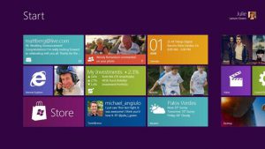
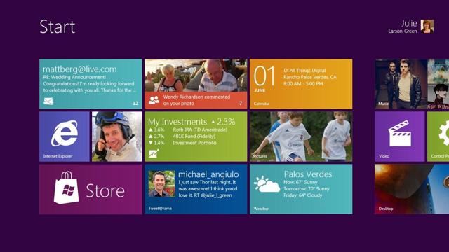
The Metro interface is generally smooth and fast, familiar of JQuery – and likely uses it. Under high load it can stutter, but not so bad as to make it unusable. There’s plenty of Metro tiles included, and the larger download has Visual Studio Express to allow developers to make their own. We’re yet to have time to play with this yet, but hope too soon.
They’ve taken heed of the problems with Vista, and stuck truly to improving on the Windows 7 experience for the home user. Behind the new glossy-style Metro screen; is the familiar Windows, with a few subtle changes in Explorer.

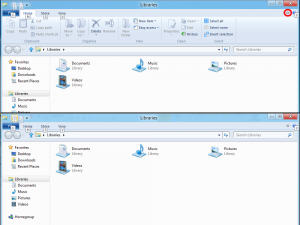
The explorer interface has had a face-lift, as previously discussed – and thankfully have taken notice of the complaints and allowed the Office-style Ribbon to be minimized as shown here:

The new Metro interface is an unusual learning curve – many of their user interfaces are slightly different; for changing settings, are counter-intuitive – or cause issues. One we’ve found is using Remote Desktop, it’s difficult to use the Start button since the new ‘Metro’ menu pops up when the mouse is in the bottom left.
Metro also offers a web browser in the form of Internet Explorer 9; however since it’s based as a Metro tile; it will be interesting to see if other web browsers are able to integrate so well into the new interface. Whether they’re able to or not, it might be one of Microsoft’s methods to try and bring confidence back to IE.
There seems few other changes, at least in this release. The new ‘Metro’ interface is undoubtedly going to be controversial; and we’re concerned about the use of Internet Explorer; but Windows 8 certainly seems to be a new direction for Microsoft.

