
Many successful websites will go through multiple rebrands before settling on a design; few people probably remember how Facebook used to look.
Many more websites are unpopular simply almost because of their design flaws. From technical reasons, such as being stuck on old frameworks and systems, or creating problems such as having too much or too little on the website, to poor understanding of their clients needs.
Everyone’s views on creative design will be different; but it doesn’t matter. The only important part of the design of your site is how it functions for you and for your customers.
It’s very common for many months to be invested by groups of experienced creatives and UI designers working tirelessly to combine all the wanted features of a website. Often many
A good website will meet the basic design needs for a visitor, and a great one will take the objectives and goals of its’ visitors foremost.
Great design takes time to evolve. Throwing away your existing site is often one of the worst courses of action. It alienates your existing customer base, destroys your search engine ranking and will lose visitors and ratings.
We’ve spoken in great deal here, and with our clients, with what works on websites, and what doesn’t. Often it isn’t as clear-cut as ‘not having overlays’ or keeping to particular widths and styles; websites are designed to showcase your content, and there will always be anomalies and requirements that are outside of such rigid requirements.
Having said that, there are a number of terrible web design trends we’ve started to see;
Hidden menus and navigation
Menus are designed to help the user to find their way around your site, not to enforce navigating in a particular way. Menus should be clear – not a set of random icons which require hovering over to understand.
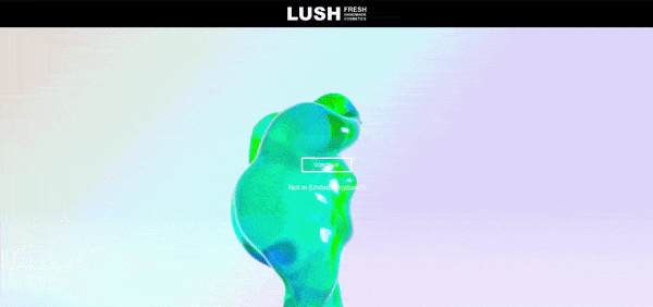
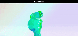
Full-screen popups and asking users for anything
Users shouldn’t be asked for their email address, telephone number, to use an iPad, nor to ‘disable their adblocker’. Full-screen popups on the first visit to websites is particularity annoying. It often feels like walking into a room, and forgetting what you came in for. It is the quickest way to increase your bounce rate and lose customers immediately. The only exception is for videos and audio – these should never autoplay.
Images everywhere
Your site might be design-inspired, but not everyone can see images, nor will they want to wait for them to load. Text is designed to be easily read on the device that it is being rendered, an image comes nowhere close.
Stop Motion
Alongside images, too much animation is equally bad. Not everything needs to move into place; this isn’t a Powerpoint presentation.
Slow Websites
No-one wants to wait for your website to load for more than 2-4 seconds. Is your website worth the wait? Loading screens are not a replacement either.
Not sure what to do? Get in contact, we can help.